Traffic Analytics
This page helps you understand who is visiting, how much traffic you’re getting, where it comes from, and what it’s requesting.
It’s designed to be non-technical and easy to scan.
What you can do
- ⏱️ Choose a time range (24h / 12h / 6h)
- 🔄 Refresh to get the newest data
- 📥 Export CSV to share numbers with your team
- 🧭 Switch views: Traffic, Country, IP, Path, Browser/OS
Page Controls
- Time range (24h / 12h / 6h): Sets the window for all charts.
- Refresh: Reloads data for the selected time range.
- Export CSV: Downloads the current view for Excel/Sheets or reporting.
- View tabs: Choose what you want to analyze:
- Traffic – requests over time (line chart)
- Country – requests grouped by country (bar chart)
- IP – top requesting IPs (bar chart)
- Path – most-requested URLs/paths (bar chart)
- Browser/OS – top user agents (bar chart)
Traffic (Over Time)
When to use: Get a sense of overall volume, peaks, and quiet periods.
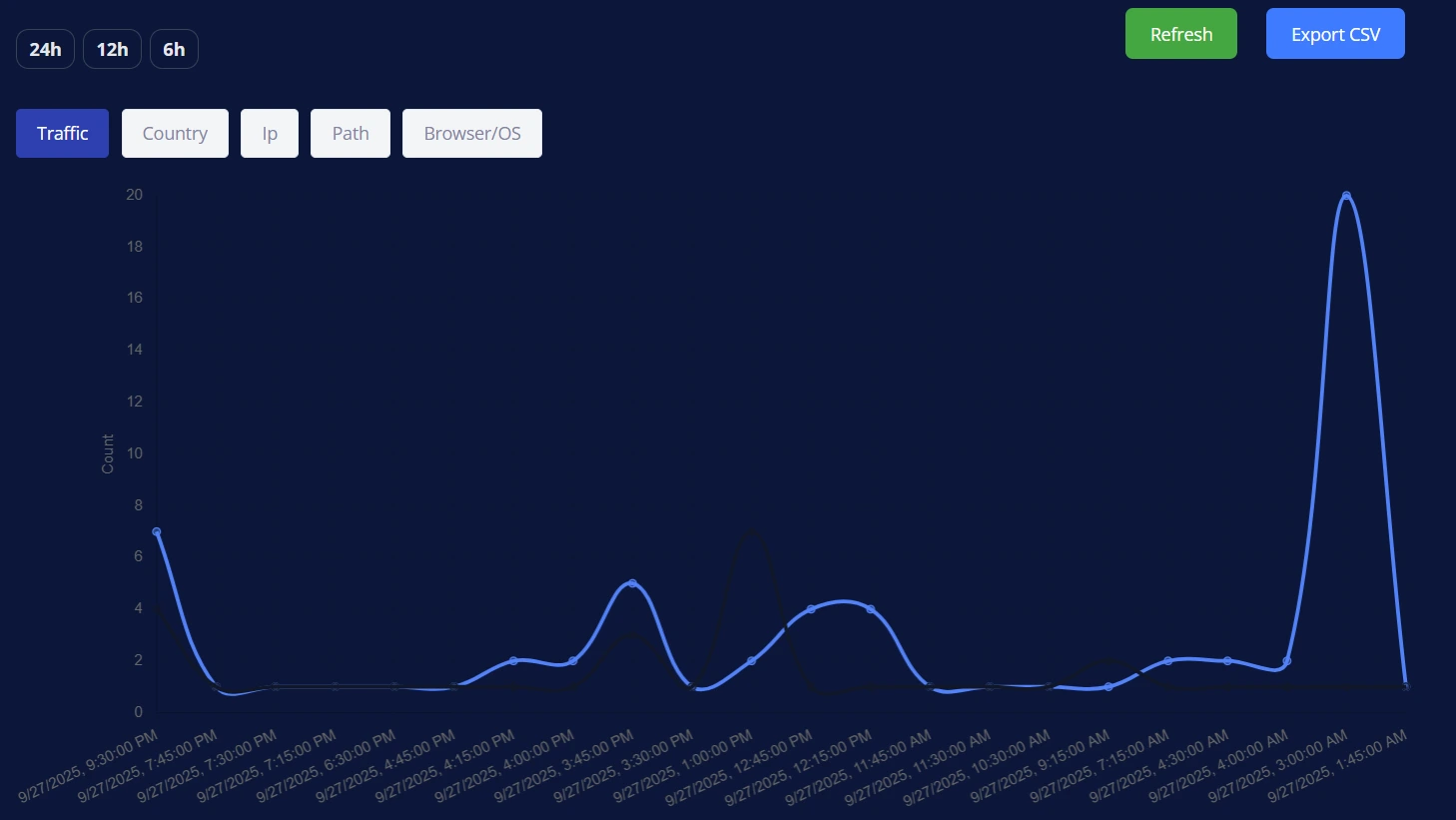
- What you see: A line chart showing request count over time.
- How to read it:
- Spikes often align with posts, promotions, or automated scans.
- Waves through the day can reflect time-zone patterns.
- A sudden sharp spike with low engagement elsewhere may indicate automated activity (bots).
Take action
- Plan content or maintenance around low-traffic periods.
- If spikes look suspicious, check the IP and Path tabs to learn more.
Country
When to use: Understand where visitors are located.
- What you see: A bar chart with requests grouped by country.
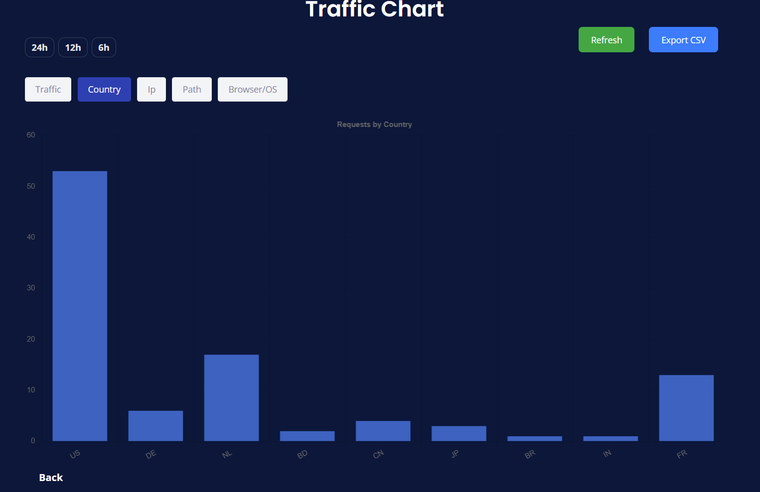
- How to read it:
- Taller bars = more requests from that country.
- Countries you don’t target still appear (global internet + bots/crawlers).
Take action
- See if traffic matches your target audience.
- Consider localizing content or timing posts for the most active regions.
- If one country dominates due to unwanted traffic, consider stronger security rules for that region.
IP
When to use: Identify heavy or unusual sources.
- What you see: A bar chart of top requesting IP addresses.
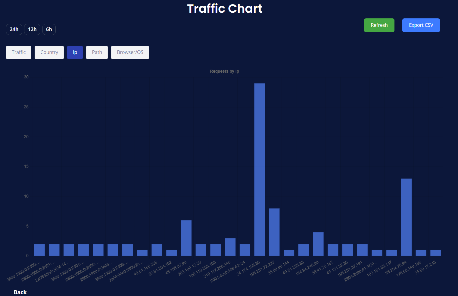
- How to read it:
- A single IP with a much higher count can indicate scraping, monitoring, or a misbehaving client.
- Many IPs with small counts usually indicates broad, normal traffic.
Take action
- Investigate outsized IPs—check Path to see what they’re requesting.
- If clearly abusive, tighten rate-limits or add a challenge for that pattern.
Path (Top URLs)
When to use: Learn what pages/paths are requested most.
- What you see: A bar chart of top URL paths (e.g.,
/,/about,/wp-login.php,/xmlrpc.php).
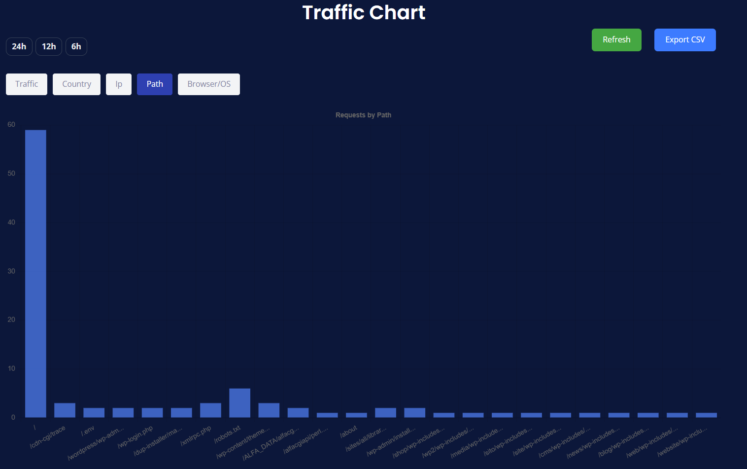
- How to read it:
- Expected leaders: your homepage (
/) and popular content. - Suspicious paths: admin panels, installers, or unknown scripts (often automated scanning).
- Expected leaders: your homepage (
Take action
- Promote content that’s already popular.
- For suspicious paths, ensure they’re protected (no public access, strong auth, or blocked if unused).
Browser/OS (User Agents)
When to use: See what clients are making requests.
- What you see: A bar chart of top user-agent strings (e.g., major browsers, apps, tools like
curl, or “Unknown”).
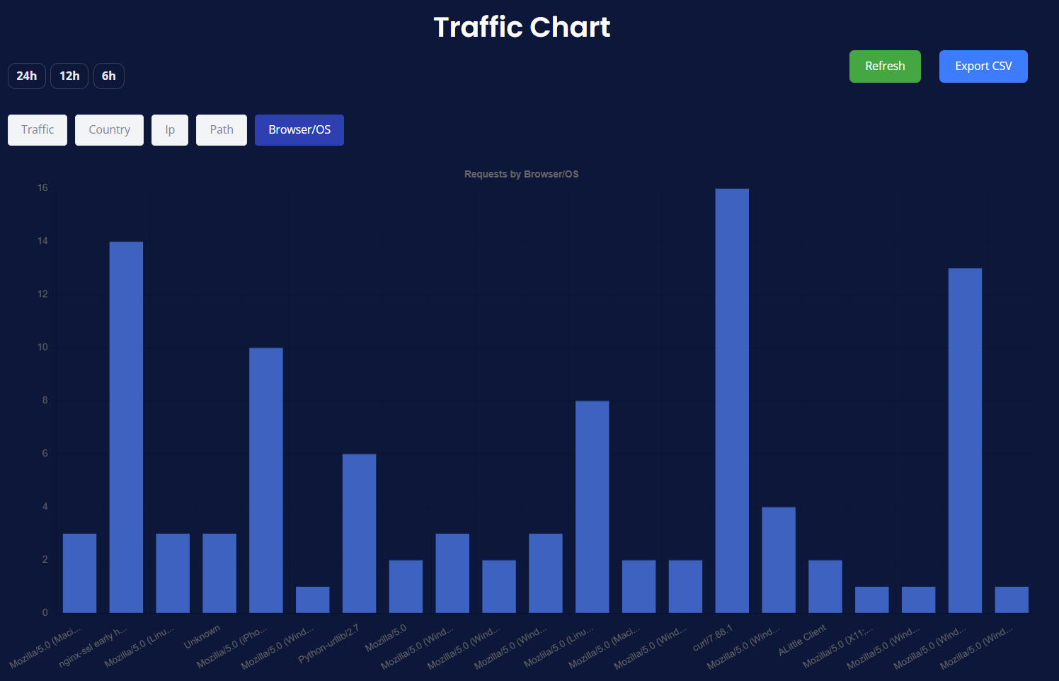
- How to read it:
- Modern browsers indicate real visitors.
- A lot of Unknown or tool-based agents can indicate automated traffic.
Take action
- Optimize for the most common browsers/OS.
- Combine with IP and Path to spot and mitigate scripted access.
Practical Workflow
- Start on Traffic for the big picture.
- Jump to Country to see where the volume is coming from.
- Check IP to identify heavy hitters.
- Open Path to understand what they’re requesting.
- Review Browser/OS to separate real visitors from tools/bots.
- Export CSV for sharing or deeper offline analysis.
Reading Patterns & Tips
- One tall spike near the end of the chart → likely a recent event (post/push/scan).
Check IP and Path to confirm if it’s organic or automated. - Consistently flat lines → try a longer window on other pages (e.g., Website Analytics) for context.
- Country outliers → consider regional security rules or content localization.
- Path outliers (admin/installers) → harden or disable those endpoints.
Accessibility & Mobile
- Keyboard-friendly: Tab through buttons, Enter/Space to activate.
- Charts adapt to screen size; in tight spaces, use Export CSV to review exact values.
- Dark theme improves contrast in low-light environments.
Privacy & Data Source
- Analytics are presented in your CloudMySite dashboard.
- Your browser never needs any third-party keys; data is rendered server-side.
FAQ
Do the charts auto-refresh?
Use Refresh to update within the same time range.
Why do I see countries I don’t serve?
The internet is global and includes bots/crawlers. Protection filters reduce noise, but some activity is expected.
What’s the best time range?
Use 24h to understand the day, 12h or 6h during launches or incidents for tighter focus.
How do I share what I’m seeing?
Click Export CSV and attach it to an email, ticket, or doc.
If something looks off or you want help deciding on protections, contact CloudMySite Support from the Help menu in the header.